-
Architects: Studio Perri Interior Design
- Area: 135 m²
- Year: 2018
-
Photographs:Gidon Levin
-
Manufacturers: Ferm Living, Itamar Carpets, Mody, Studio Kahn, Tollman’s, United Seats, under 1000

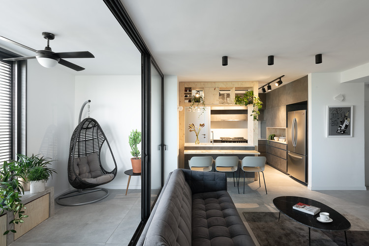
Text description provided by the architects. A young couple moved from central tel aviv to a bigger and quieter apartment in north tel aviv and invited Studio PERRI to plan and design their new home. The apartment is 135 m² in size and includes a living room, kitchen, dining area, balcony, 4 rooms, 2 bathrooms, storage room and a small room foe the cats. Before the renovation The apartment was divided into two units - a large apartment and a separate small unit. The building is old from the 70's and the apartment had never been renovated before. The tenants dreamt of a spacious and full of light apartment that would provide an accurate response to their needs. The guidelines were to create a modern and minimalist design that balances beauty and functionality.

Almost all the walls of the interior were destroyed in the renovation except for the pillars of support and two walls in the son's room. We set up the kitchen and the storage room where the separate unit was, thus turning the kitchen into part of the bright and open living space.

The kids play room was designed where the old kitchen was and all its walls were destroyed except for a supporting column. In order to create an internal balcony we took advantage of the bulge in the exterior contours of the building and designed a balcony that is isolated from the house by internal large windows. The original narrow corridor was enlarged, and the master room was redesigned with two parallel wardrobes leeding to the adjacent bathroom. All the Bathrooms were redesigned in the area of the old bathrooms but in a completely different way.

We have replaced the flooring, wall coverings, sanitary equipment, electrical systems, plumbing and air conditioning, interior and entrance doors, windows, lighting, furniture, and the carpentry items throughout the apartment. We connected to the dreams and desires of the customers From the beginning, and created a shared vision that guided us in designing the apartment. The front door leads to the hallway created from multi-functional furniture that we designed. The furniture separates the entrance hall from the living space, allows intimate entry into the private rooms area, and provides a useful solution for storing shoes, sunglasses, keys and other furniture. The back of the furniture serves as a closet for coats and bags.

It was important for us to create a coherent and tight design style, so we defined a palette of colors and materials that is repeated in the carpentry items, finishing materials, lighting and furniture: maple wood, gray, white and black wood veneers with color touches of blue, gold and red.

The kitchen was designed to allow eye contact with the entire living room and the play room, with a counter surrounded by a wooden frame: the frame creates a setting of the kitchen without closing it, and also serves for high storage of alcohol, hanging glasses of wine and decoration.

The materials we chose for the kitchen were in accordance with the tenants' demand to design a functional and durable kitchen: Formica in dark concrete texture, and wood root veneer map, the contrast creates an interesting and dramatic combination and both durable and strong materials. Behind the kitchen is the storage room - a room with floor-to-ceiling cabinets, which serves both as a laundry room and as a multi-purpose storage space.


